ParkAlot

Redesigned core parking journey to help drivers find and navigate to nearby parking with less confusion.

Collaboration
  • 1 Developer
Tools Used
  • Figma
  • Photoshop
  • Google Forms
  • Copilot
  • VS Code
View Prototype
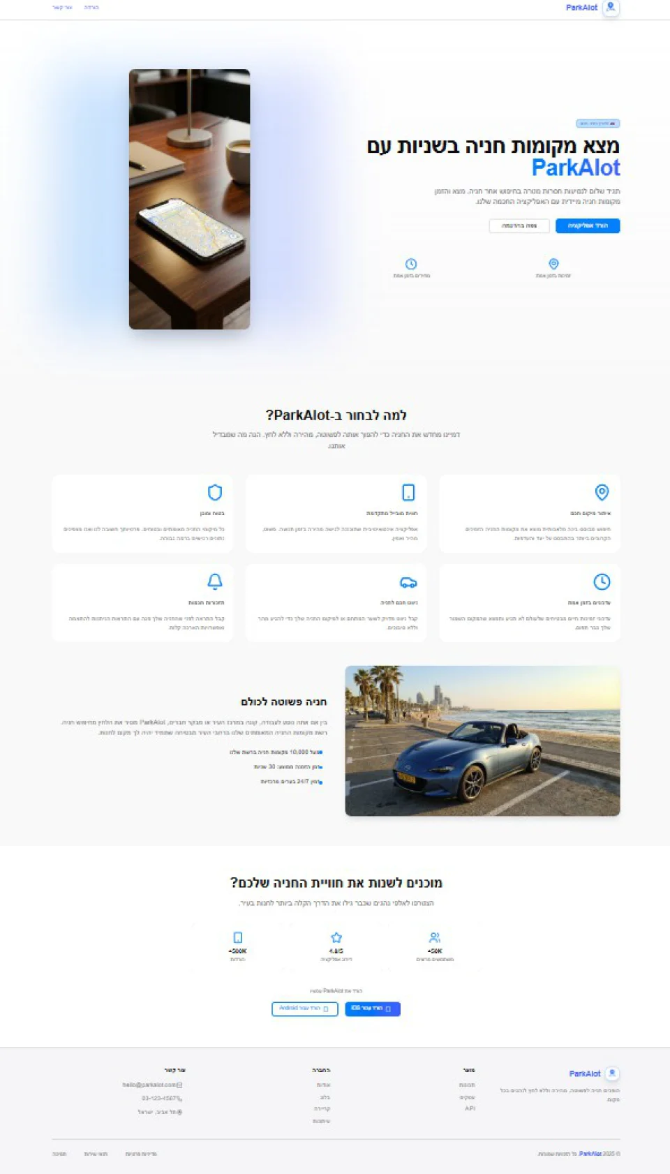
ParkAlot parking search and nearby parking results on a phone held by white sculpted hands

Introduction

ParkAlot is a parking app that helps drivers find, compare and choose nearby parking in car-dependent cities. The existing build worked but was hard to use, so the product was reviewed screen by screen, redesigned around real drivers’ journeys and improved while preserving much of the developer’s original design system. It was then tested again with users after release.

The Challenge

The existing app was functional, but did not fully reflect how drivers search for parking under time pressure. The redesign focused on simplifying this journey.

Context

The Goal

Simplify the parking experience by helping drivers quickly find, compare and choose nearby parking options while saving time and lowering costs in car-dependent urban environments.

Target Users

Independent drivers aged 24 and above who frequently search for nearby parking options in large urban areas.

User Flow

The flow represents the app’s primary scenario, highlighting how it supports drivers who need to find nearby parking.

User Survey

METHOD
Qualitative, Semi-structured interviews
FORMAT
Face-to-face usability testing
SAMPLE
8 participants

WHY THIS APPROACH

The product was still in development and available only in test mode, so guerrilla approach testing was the fastest way to gather actionable feedback.
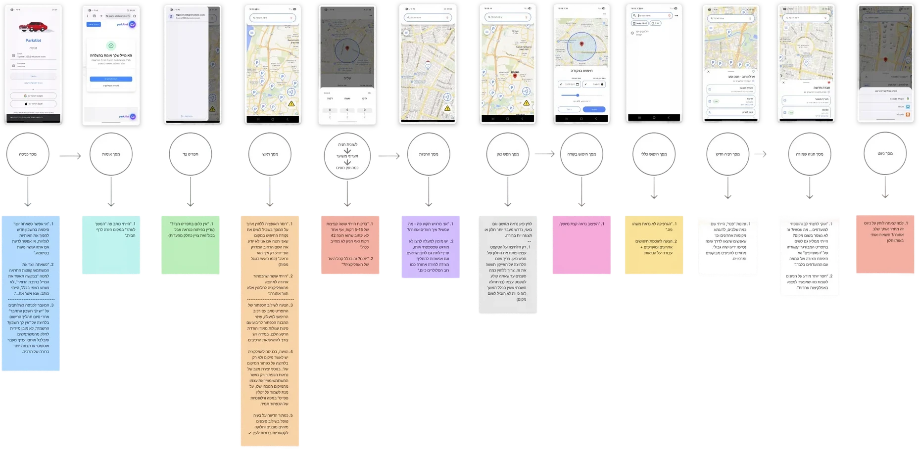
ParkAlot usability research board linking twelve app screens to interview questions and participant observations

Before & After Screens

Every screen of the original build was reviewed against its redesign, from authentication through the core parking flow.
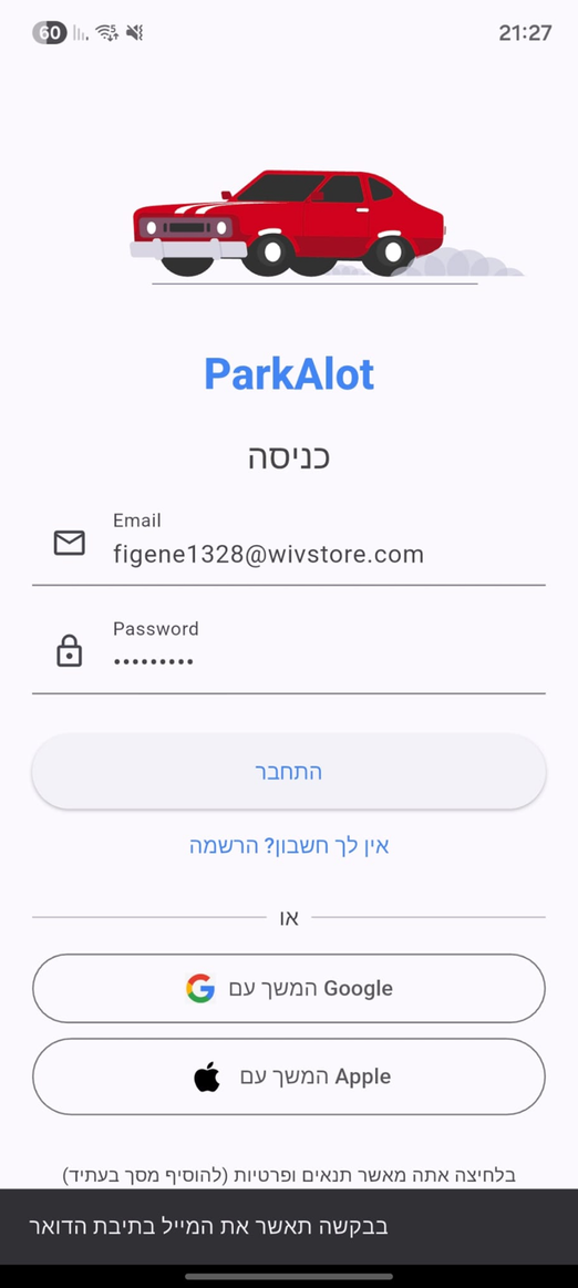
SCREEN 01 · AUTHENTICATION

ParkAlot authentication: original app screen
Sign In / login enhancements
  1. Added a visible password toggle to reduce input errors during account creation.
  2. Improved the transition between registration and login by introducing a clearer visual flow and reducing user confusion after sign-up.
  3. Refined system notifications and microcopy to create a clearer and more professional onboarding experience.

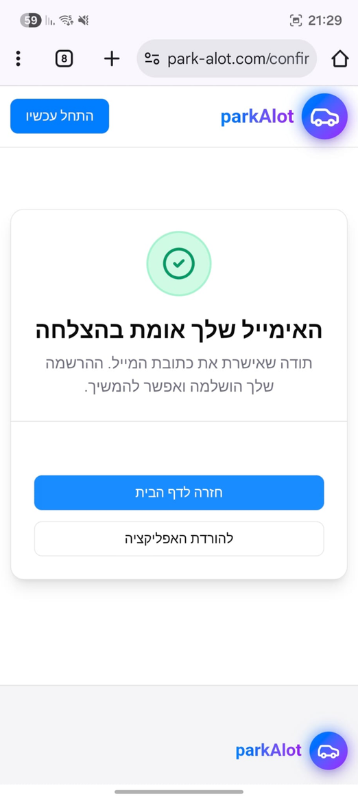
SCREEN 02 · ACCOUNT CONFIRMATION

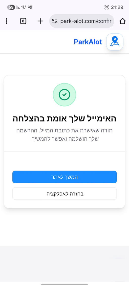
ParkAlot account confirmation: original app screen
Microcopy improvements
ParkAlot account confirmation: Microcopy improvements
  • Refined button labels and CTA wording to better match the user’s current flow from entering the mobile app and reduce confusion.

SCREEN 03 · MAP INTERACTIONS

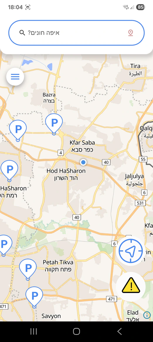
ParkAlot map interactions: original app screen
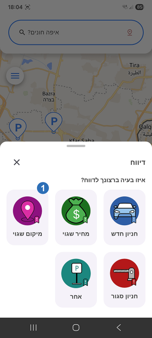
Fixed report categories
ParkAlot map interactions: Fixed report categories
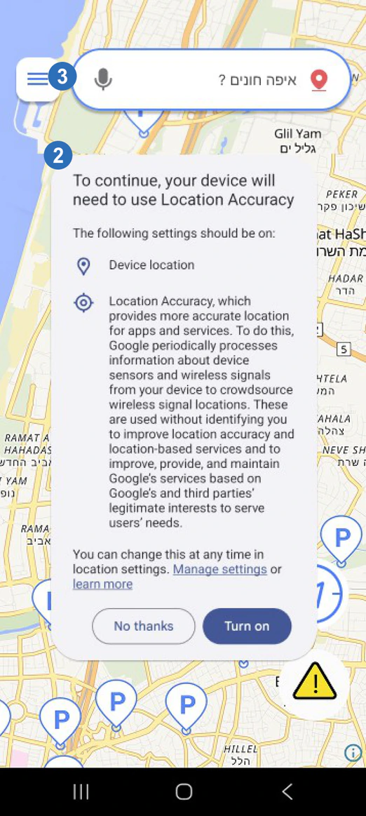
Location permission prompt
ParkAlot map interactions: Location permission prompt
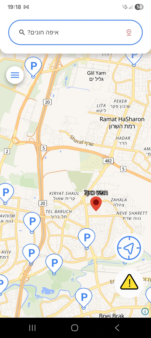
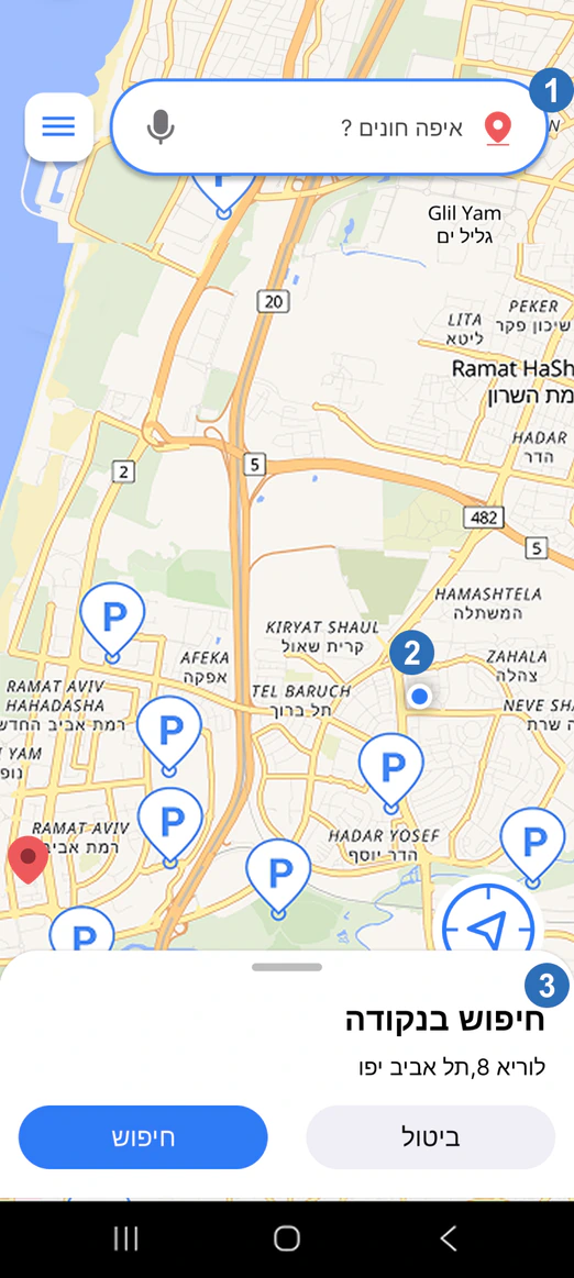
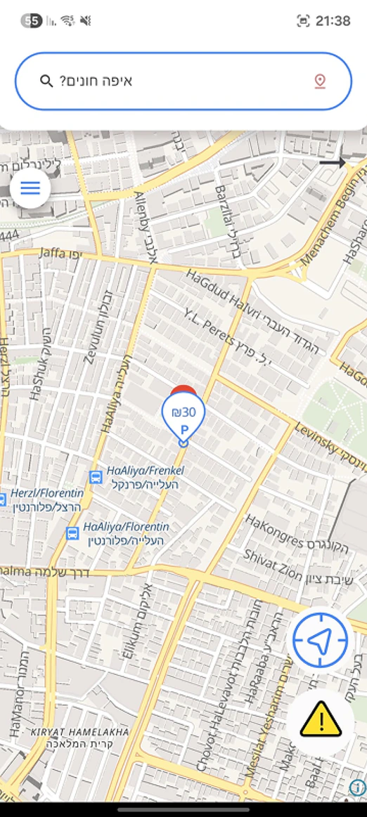
Search & location controls
ParkAlot map interactions: Search & location controls
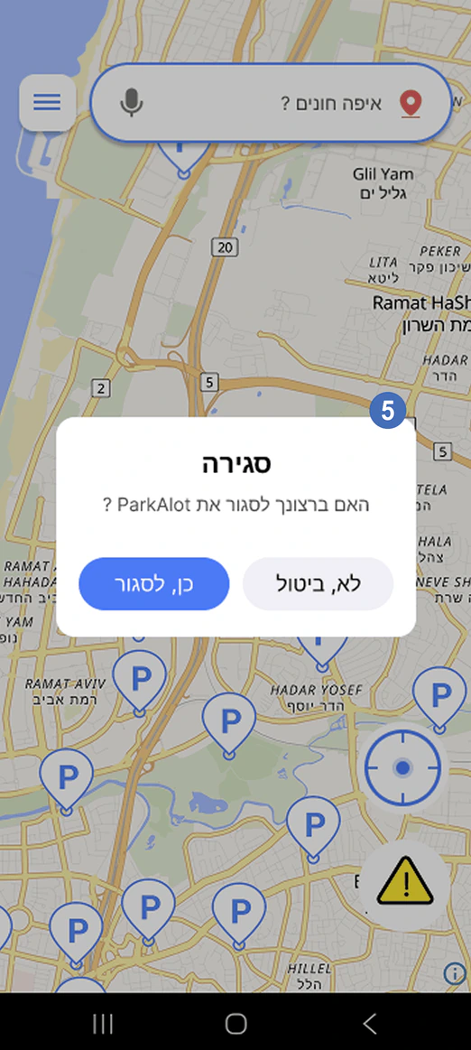
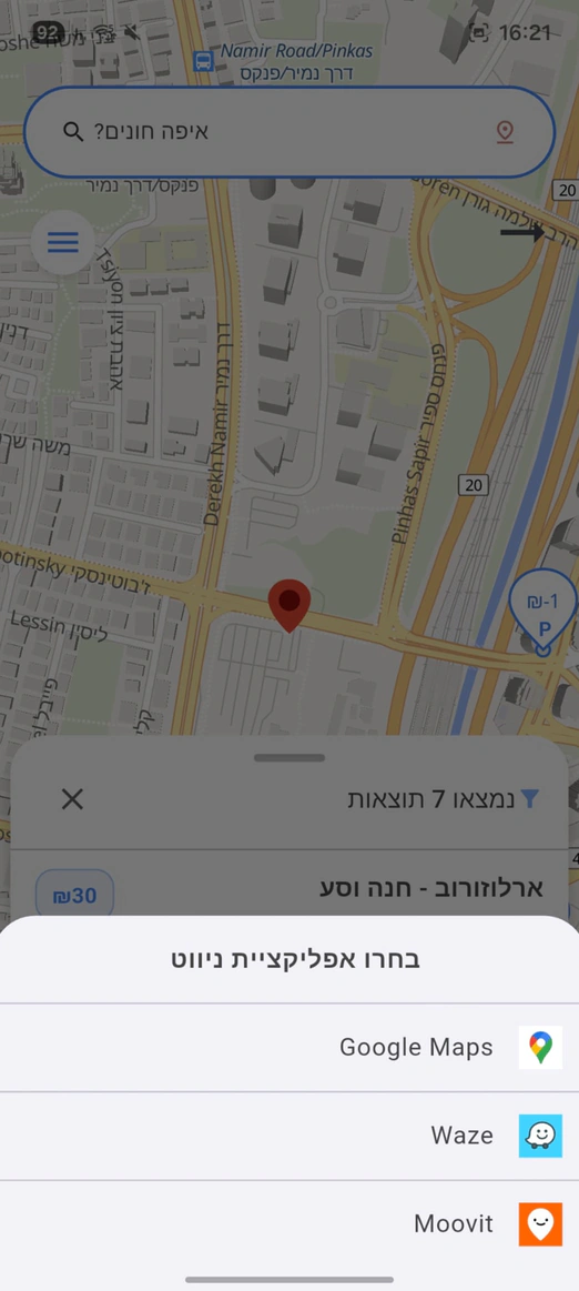
Exit app modal
ParkAlot map interactions: Exit app modal
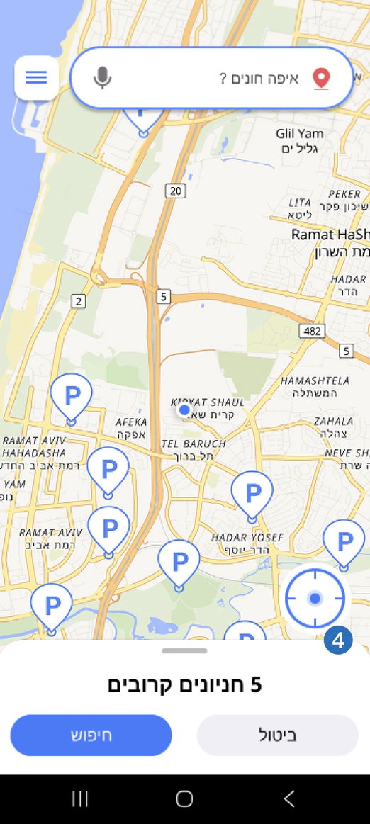
  1. Improved the problem-report system by adding clearer identifying icons and visually separated reporting categories.
  2. Introduced location permission approval on app entry and added dynamic location button states to better inform users about their current position.
  3. Redesigned the search and menu area by combining components, simplifying the button shape, and reducing unnecessary map obstruction.
  4. Added long-press map interaction to allow users to select locations visually without needing the exact street name.
  5. Added an exit confirmation modal to prevent users from leaving the app immediately when pressing the back button.

SCREEN 04 · SEARCH INTERACTION

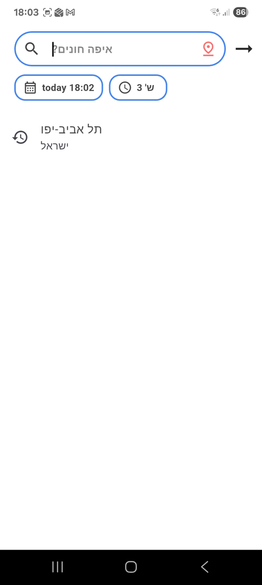
ParkAlot search interaction: original app screen
Improved location search
ParkAlot search interaction: Improved location search
  1. Expanded the clickable area of the search component so both the text and icon trigger the interaction.
  2. Improved interaction feedback and touch responsiveness to reduce confusion and repeated presses.
  3. Refined the “Search Here” interaction with clearer visual guidance and smoother transitions to improve usability.

SCREEN 05 · SEARCH EXPERIENCE

ParkAlot search experience: original app screen
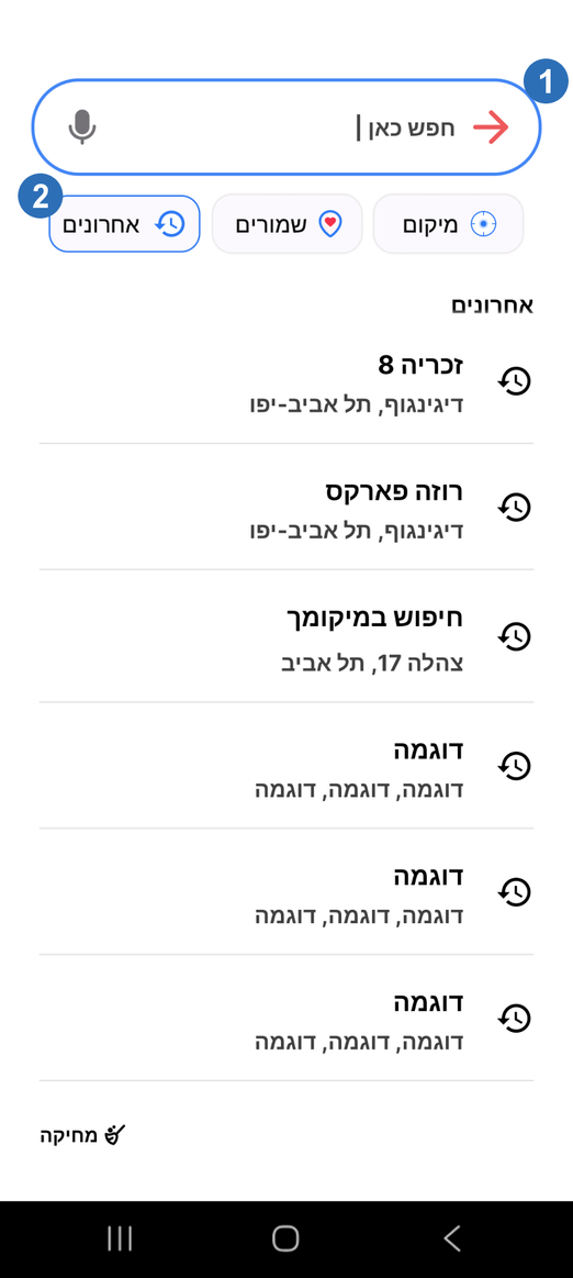
Search history
ParkAlot search experience: Search history
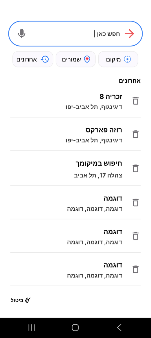
Clear searches history
ParkAlot search experience: Clear searches history
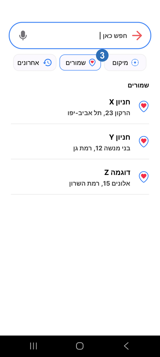
Saved searches
ParkAlot search experience: Saved searches
  1. Improved location search visibility and guidance to make the search flow more intuitive for users.
  2. Refined the visual design and graphics to create a cleaner and more modern interface.
  3. Added recent searches and favorites to improve accessibility and speed up repeated parking searches.

SCREEN 06 · SEARCH PREFERENCES

ParkAlot search preferences: original app screen
Parking location search
ParkAlot search preferences: Parking location search
Nearby search
ParkAlot search preferences: Nearby search
  • Refined the UI to improve visual clarity, consistency, and overall usability.

SCREEN 07 · INPUT INFORMATION

ParkAlot input information: original app screen
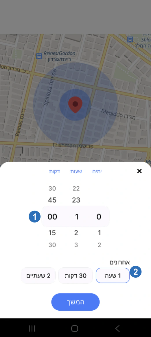
Date modal
ParkAlot input information: Date modal
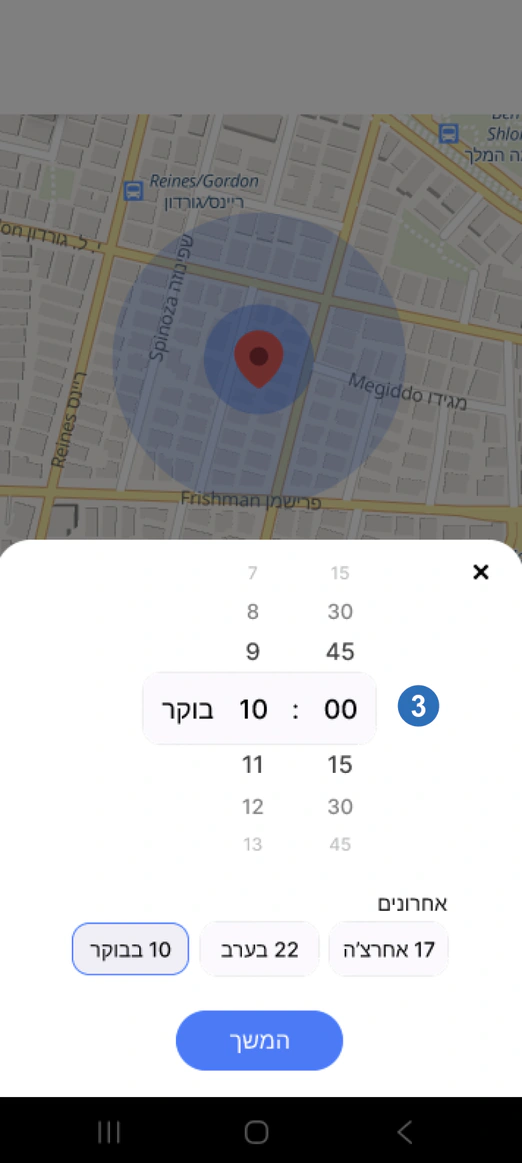
Time modal
ParkAlot input information: Time modal
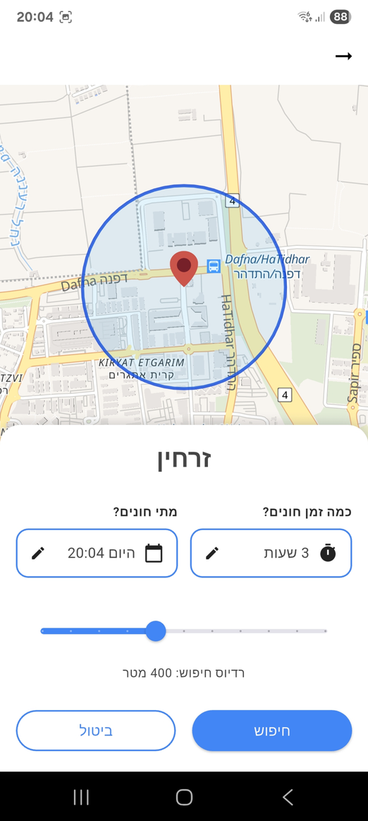
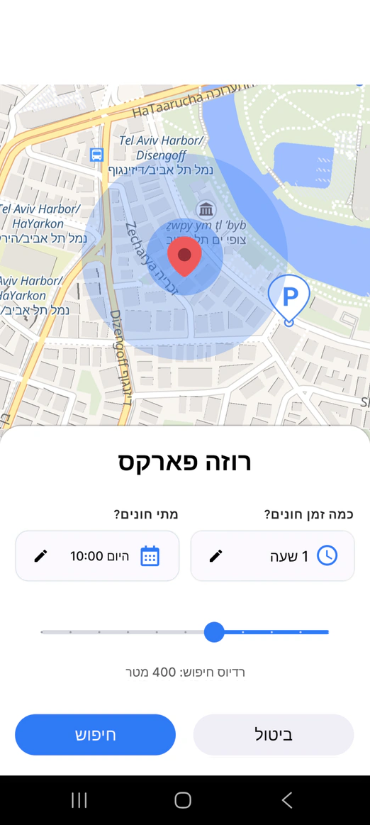
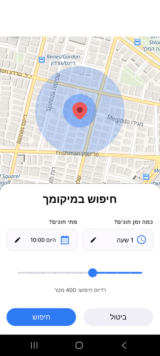
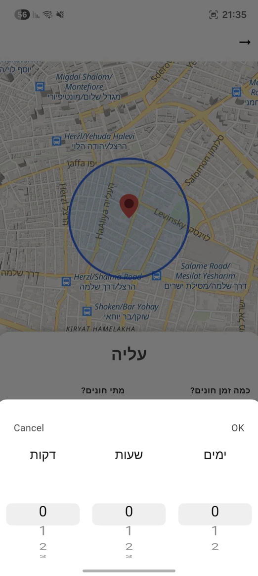
  1. Simplified time selection by replacing unrealistic minute inputs with more practical parking duration increments.
  2. Refined the parking duration flow to better align with the app’s primary target audience and real-world parking behavior.
  3. Reorganized the date and time selection into clearer controls with practical presets, reducing manual input.

SCREEN 08 · PARKING LIST EVOLUTION

ParkAlot parking list evolution: original app screen
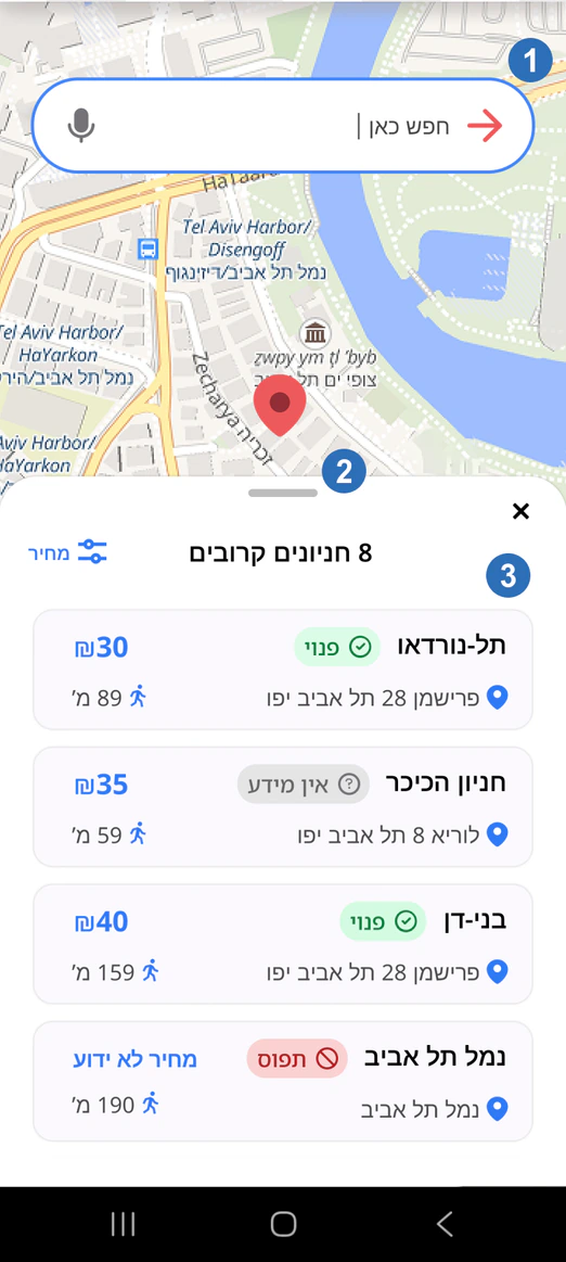
Parking list alpha
ParkAlot parking list evolution: Parking list alpha
Parking scroller cards Beta
ParkAlot parking list evolution: Parking scroller cards Beta
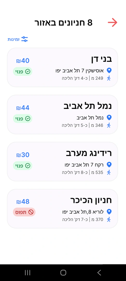
Parking list final
ParkAlot parking list evolution: Parking list final
  1. Improved navigation clarity by reducing dead-end interactions and making the return flow more intuitive for users.
  2. Added more visible back navigation and swipe-back interactions aligned with common mobile usability patterns.
  3. Researched and explored list-based navigation solutions to better guide users while browsing parking options.

SCREEN 09 · PARKING INFORMATION

ParkAlot parking information: original app screen
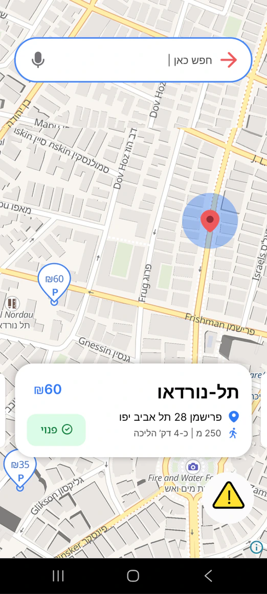
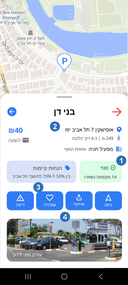
Parking card improvements
ParkAlot parking information: Parking card Improvements
  1. Introduced multiple parking availability states such as “Last Spots” to better reflect real-time parking conditions in busy areas.
  2. Expanded parking lot information to provide users with more detailed and useful data when comparing parking options.
  3. Improved the favorites experience by adding a dedicated favorites category and a focused map view for saved locations.
  4. Reorganized parking details into a clearer card hierarchy with grouped actions and visual information, making options easier to scan and compare.

SCREEN 10 · NAVIGATION

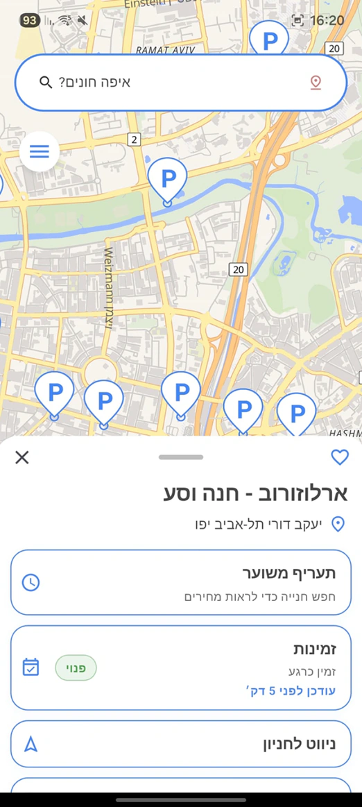
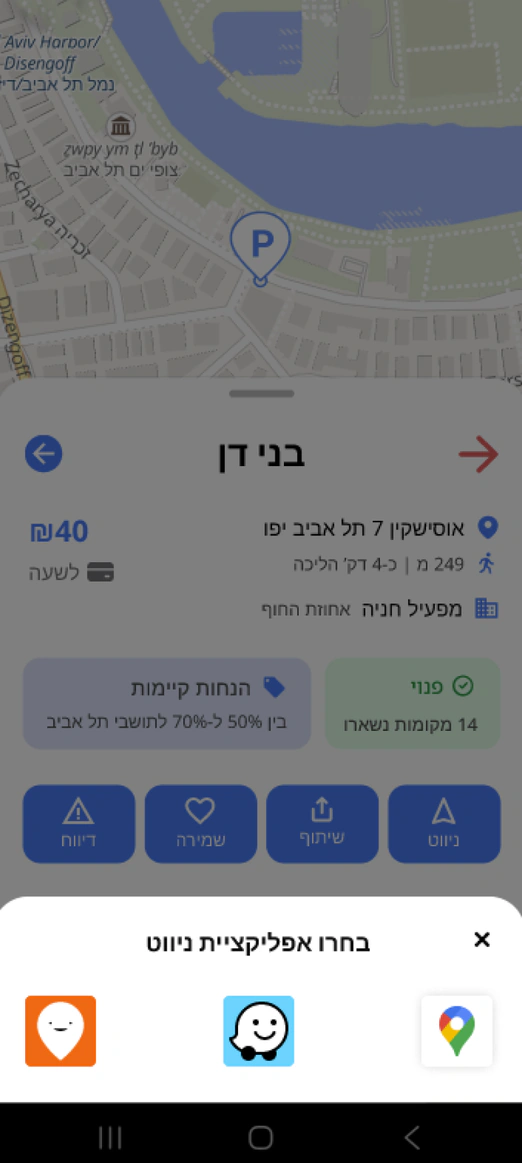
ParkAlot navigation: original app screen
Navigation panel redesign
ParkAlot navigation: Navigation panel redesign
  • Improved navigation behavior by keeping users within the same flow after starting navigation actions, reducing unnecessary backward transitions and confusion.

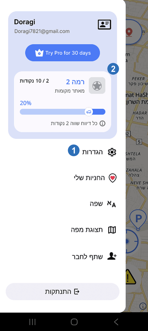
SCREEN 11 · SIDE MENU

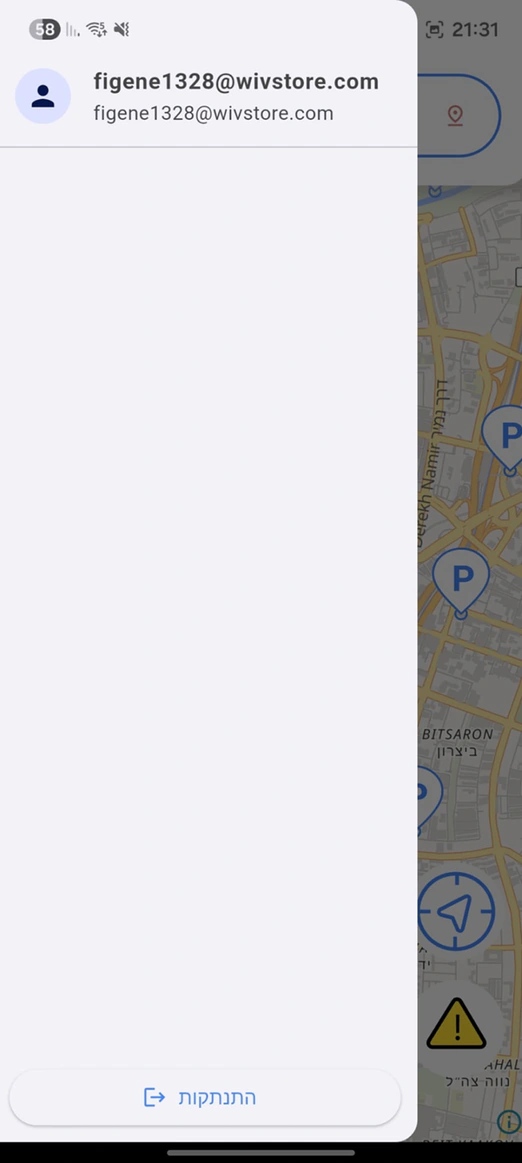
ParkAlot side menu: original app screen
ParkAlot side menu: intermediate redesign
Side menu enhancements
ParkAlot side menu: Side menu enhancements
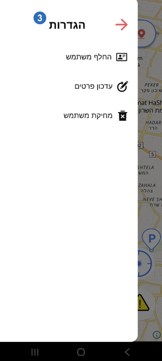
Settings integration
ParkAlot side menu: Settings integration
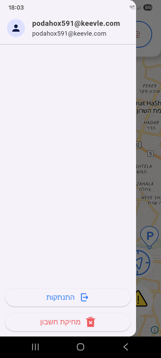
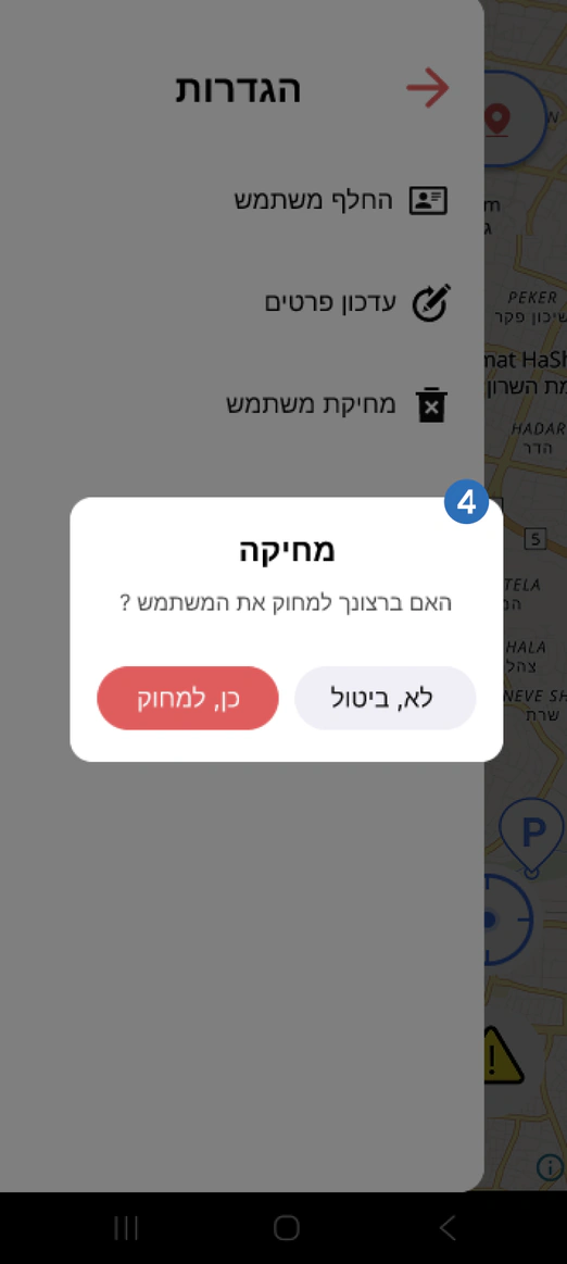
Delete account modal
ParkAlot side menu: Delete account modal
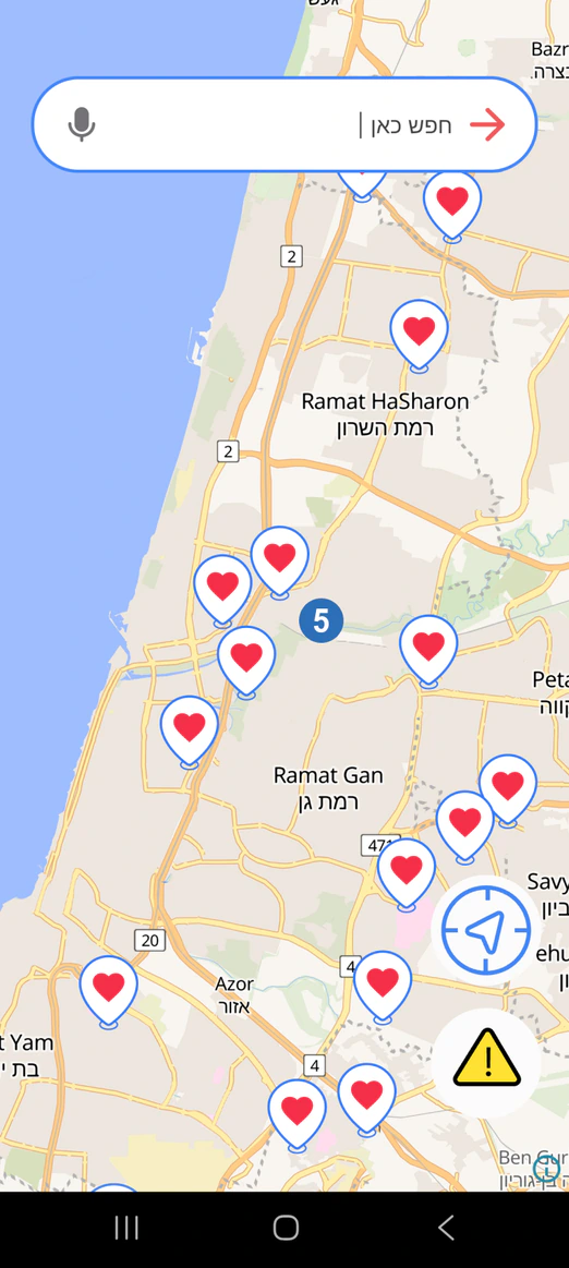
Saved parking map
ParkAlot side menu: Saved parking map
  1. Expanded the side menu from an empty state into a functional navigation area with useful account and app options.
  2. Added membership and ranking components to support monetization and encourage users to contribute parking data.
  3. Added a dedicated settings area to organize account management and preferences.
  4. Moved account deletion into settings and added a confirmation modal to prevent accidental deletion.
  5. Added a saved parking map to give users quick access to their favorite parking locations.

Landing page

A rebrand of the product presented as a marketing site, with two redesign routes built in Figma and in React. The new name was chosen for its familiarity within the parking space, helping the product feel more recognizable and credible. In addition, I conducted an SEO check for the landing page and identified improvements to support better visibility, structure, and search performance

Original page

Redesign A

Redesign B

Feedback

After the first official release the same users were surveyed again, to measure whether the redesign actually improved.

  • Strongly agree
  • Agree
  • Not sure
  • Disagree
  • Strongly disagree

User interface improvements

Does the updated interface feel clearer and easier to use?

  1. Participant 1: Strongly agree
  2. Participant 2: Agree
  3. Participant 3: Agree
  4. Participant 4: Agree
  5. Participant 5: Agree
  6. Participant 6: Agree
  7. Participant 7: Agree
  8. Participant 8: Not sure

N=8, Each segment represents one participant.

Database improvements

Did you notice a broader, more useful range of parking information available to you?

  1. Participant 1: Strongly agree
  2. Participant 2: Agree
  3. Participant 3: Agree
  4. Participant 4: Agree
  5. Participant 5: Agree
  6. Participant 6: Agree
  7. Participant 7: Agree
  8. Participant 8: Not sure

N=8, Each segment represents one participant.

Feature enhancements

Do the added or refined features better support your parking needs?

  1. Participant 1: Strongly agree
  2. Participant 2: Agree
  3. Participant 3: Agree
  4. Participant 4: Agree
  5. Participant 5: Agree
  6. Participant 6: Not sure
  7. Participant 7: Disagree
  8. Participant 8: Disagree

N=8, Each segment represents one participant.

Parking discovery process improvements

Is finding and choosing a parking spot quicker and more intuitive in this version?

  1. Participant 1: Strongly agree
  2. Participant 2: Strongly agree
  3. Participant 3: Strongly agree
  4. Participant 4: Agree
  5. Participant 5: Agree
  6. Participant 6: Agree
  7. Participant 7: Not sure
  8. Participant 8: Disagree

N=8, Each segment represents one participant.

Key Insights

Based on user comments and conclusions drawn from the data gathered during research.

  1. Greater Map Control

    Users wanted the ability to move and explore the map while choosing a parking lot instead of it being fixed, showing that spatial freedom is important for confident decisions.

  2. More Flexible Date & Time Search

    Participants preferred broader date ranges and manual input over quick selectors, indicating the need for more granular filtering options.

  3. Data Accuracy & Coverage Matter

    Some inconsistencies in parking prices and missing lot information reduced trust, highlighting the importance of up-to-date and complete data.

  4. Overall Improvement

    Most survey responses agreed that the redesign improved clarity, feature usefulness and the speed of finding parking, suggesting a positive usability trend.