The Goal
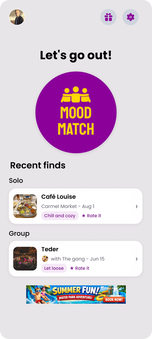
Mood Match was created to make going out simple and inspiring. The app’s goal is to connect people with experiences that match their mood and vibe whether solo or with friends.
Matched people with a relevant place to go out based on their vibe and preferences.


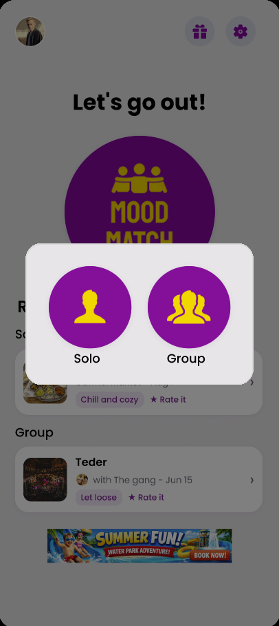
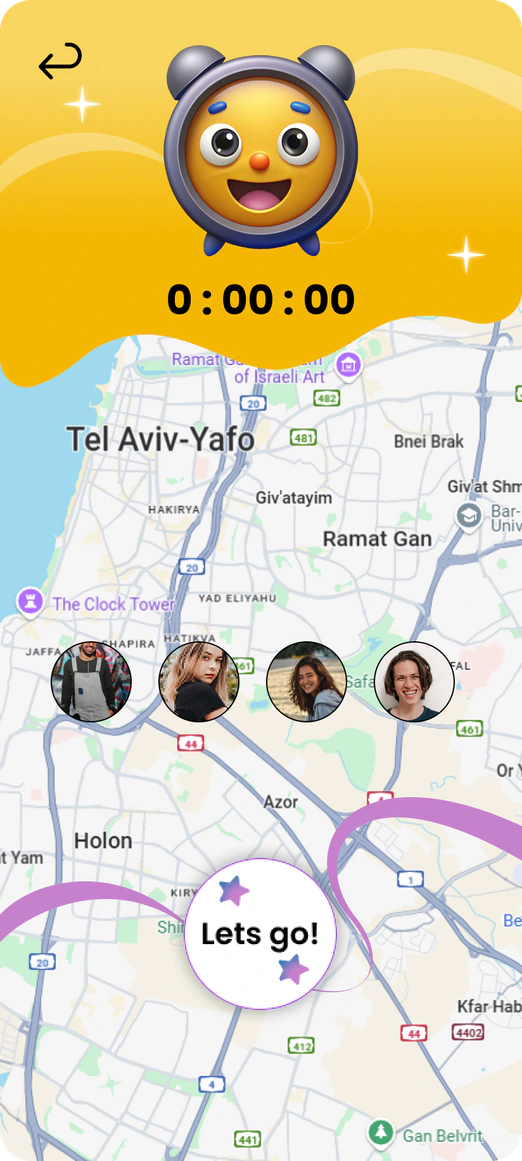
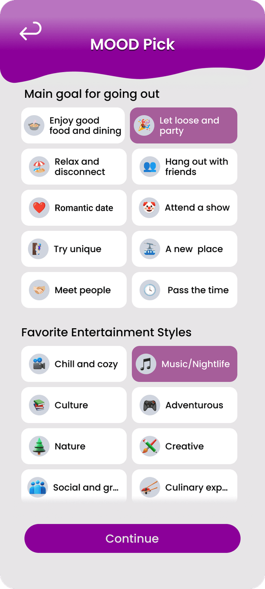
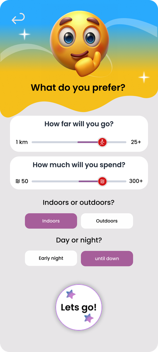
Mood Match is a mobile app that recommends where to go out based on a person’s mood, available time and location, whether they are heading out alone or with friends. This case study follows the project from competitor and user research through personas, information architecture, flows and business model, to the design system and the final screens.
Going out should feel spontaneous, but planning it rarely does. I started by defining the goal, the problem and the people it affects, then looked at what the apps they already use get wrong.
Mood Match was created to make going out simple and inspiring. The app’s goal is to connect people with experiences that match their mood and vibe whether solo or with friends.
People often find it hard to plan where to go out. Existing apps give outdated or scattered information and don’t match the user’s mood or group needs. This causes wasted time, confusion and missed chances for fun experiences.
| Criterion | Easy | Zappa | Tiuli | Karamel |
|---|---|---|---|---|
| Discovery | Nearby venues by category | Events by date and venue | Trails by region and difficulty | Activities by category |
| Freshness | Open-now filter | Dated event listings | Season filters, user trail updates | Not verified |
| Personalization | Favorites/history; tailored suggestions not checked | Favorites; tailored suggestions not checked | Route filters; tailored suggestions not checked | Not verified |
| Group planning | Not verified | Not verified | Not verified | Group activities listed, shared planning not checked |
| Booking | Not verified | Ticket purchase | Not verified | Not verified |
| Trust signals | Ratings and reviews | Official event details | Route details and user updates | Provider listings; verification not checked |
| Official sources | easy.co.il | zappa-club.co.il | tiuli.com/tracks | karamel.co.il |
A quantitative survey of 40 people and a round of in depth interviews, turned assumptions into evidence and the patterns that came back became the two personas the rest of the project was designed around.
First Research Method: Quantitative survey. Sample Size: 40
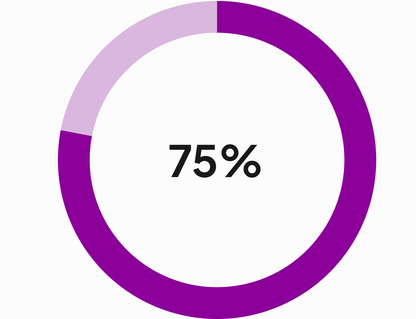
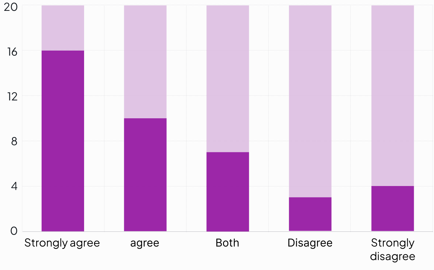
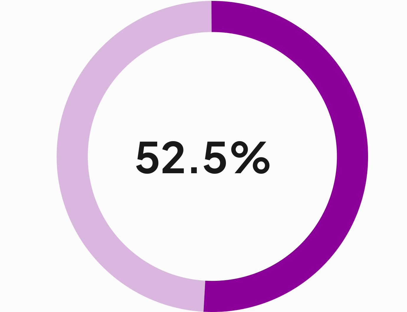
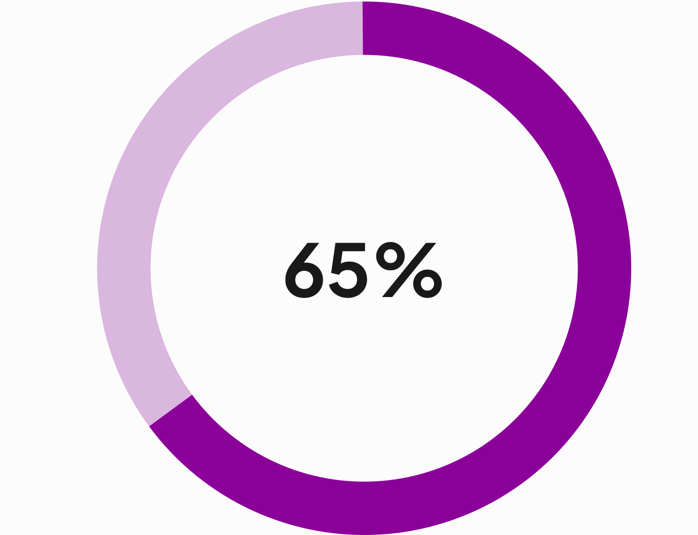
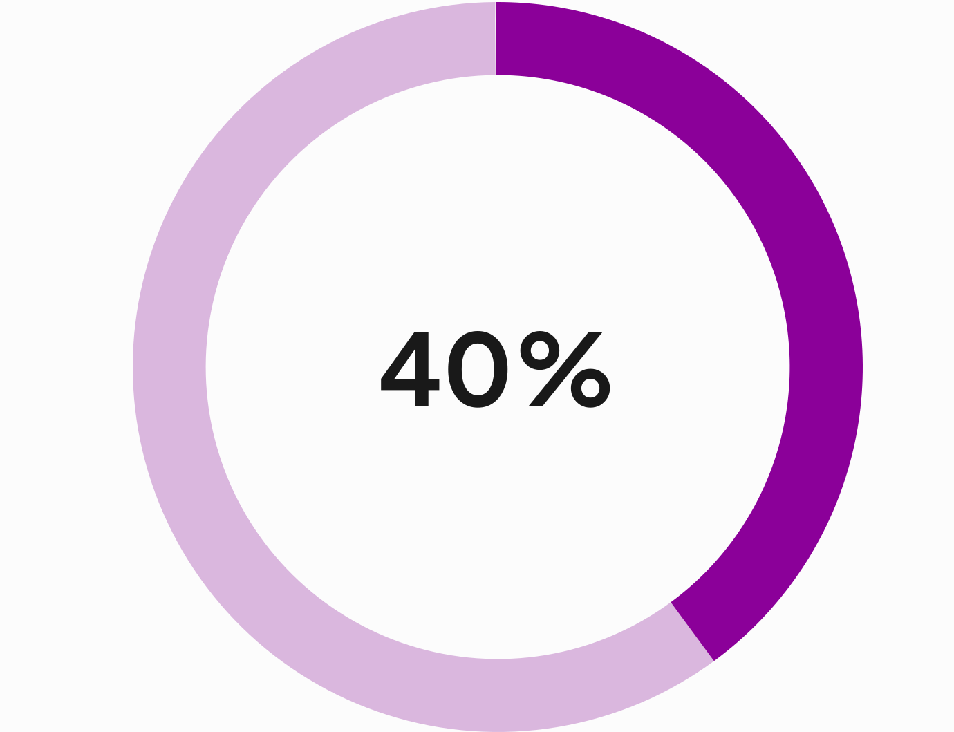
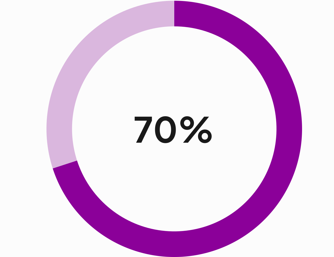
Second Research Method: Qualitative in depth semi structured interviews using voice to text AI transcription. Sample Size: 6
“You end up jumping between Google, WhatsApp, and apps like Easy, and in the end you just get lost. An app that organizes everything in one place would make the process much easier.”
“Many times I don’t even know what I feel like doing. If something could suggest ideas for me, it would help me actually go out instead of staying stuck at home.”
“I arrived at a place that Easy showed as open, but it was closed. If an app gave me reliable, updated info, I would trust it and use it more.”
“Usually I wait for a friend to organize the night. If it doesn’t work out, I just go back to sleep. If there was a way to plan together easily, it would really help.”
“Most apps don’t feel real, what they show in photos isn’t what you actually get. I want something that feels authentic and reliable.”
“Too many ads or fake recommendations would turn me off. If it’s not real or trustworthy, I just won’t use it.”

University Student
Tel Aviv, campus
23 years old

Marketing in Tech
Tel Aviv, apartment
29 years old
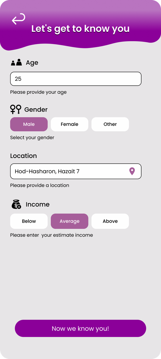
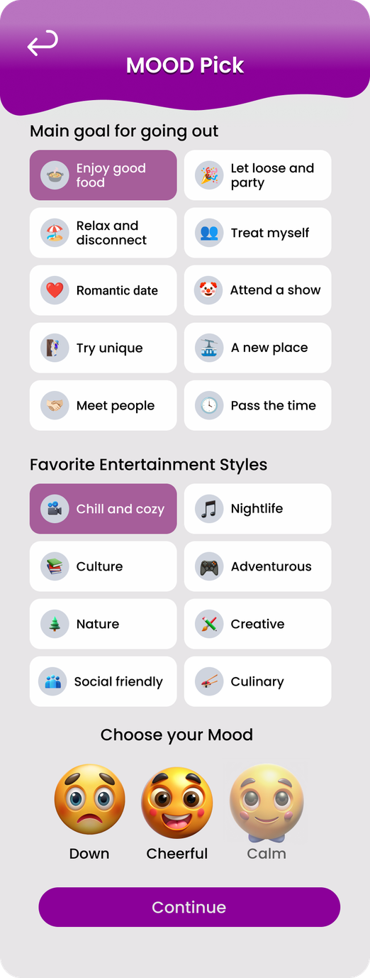
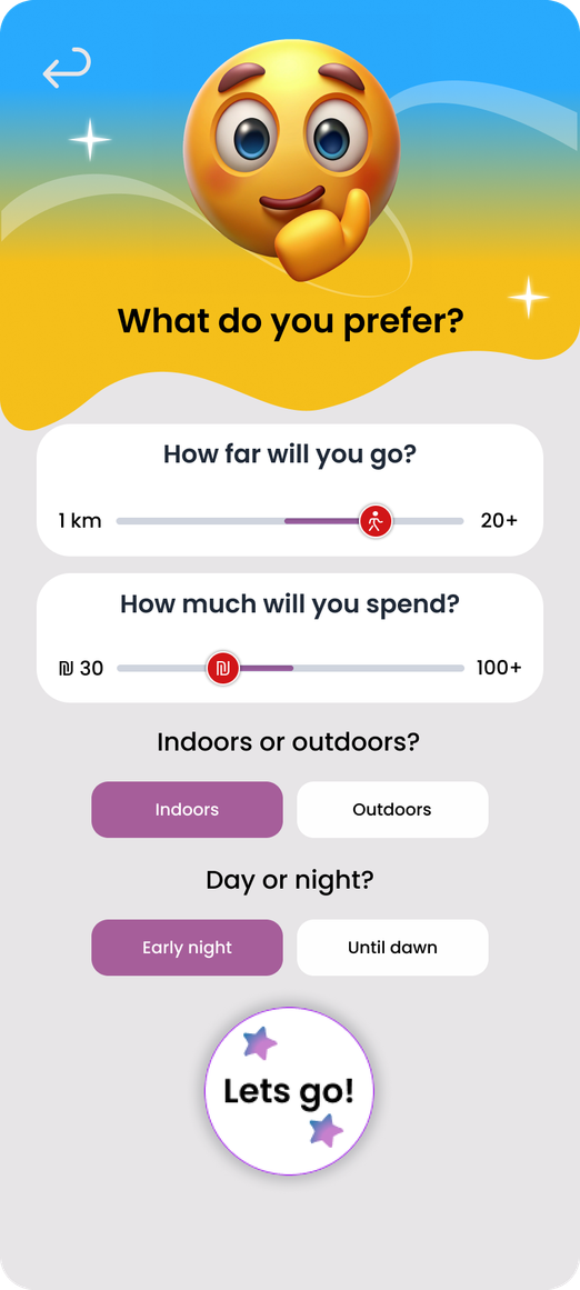
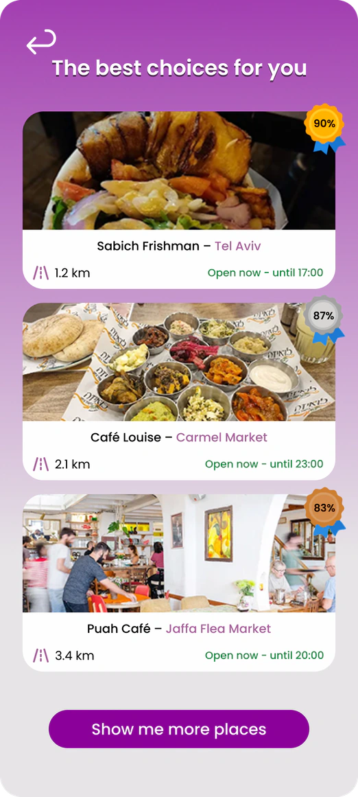
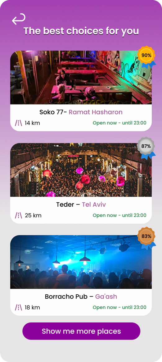
A mobile app that helps people find where to go out fast, simple and stress free. By analyzing users’ preferences, time and location, it recommends nearby experiences.
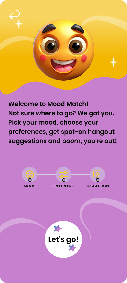
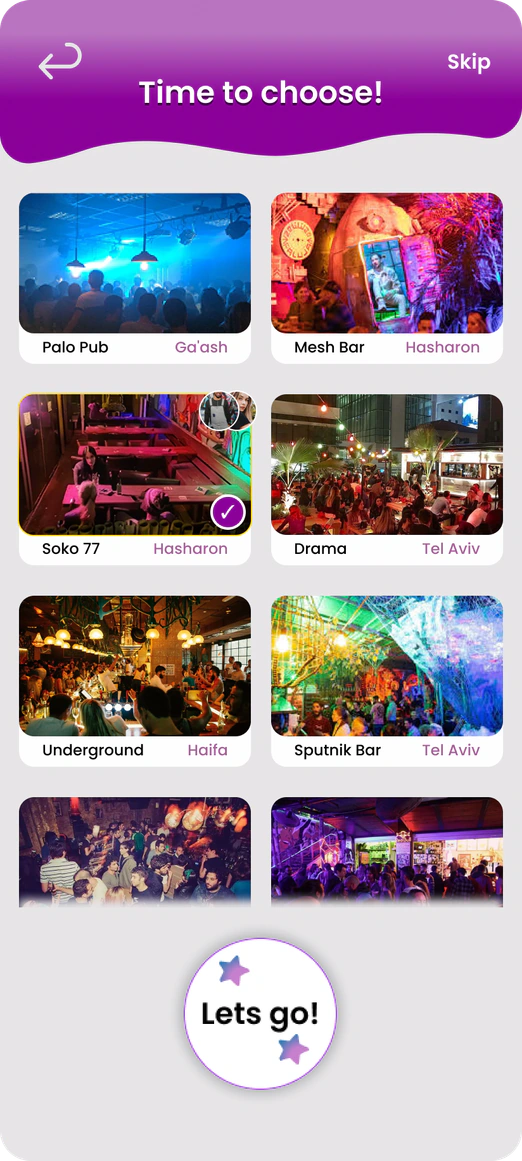
Using a based mood system, the app personalizes suggestions to both individuals and groups. It brings one smooth flow so users can stop scrolling between apps.
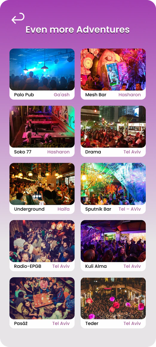
A mood based recommendation flow that replaces scrolling between apps. This chapter covers what the product does, how its content is structured, how people move through it and how it earns.

I chose these scenarios from the two personas to highlight key moments where the app creates value: helping Dani quickly find a place that matches his mood and budget, and helping Michal coordinate group plans smoothly so everyone can choose a place that fits their shared vibe without long discussions or wasted time.

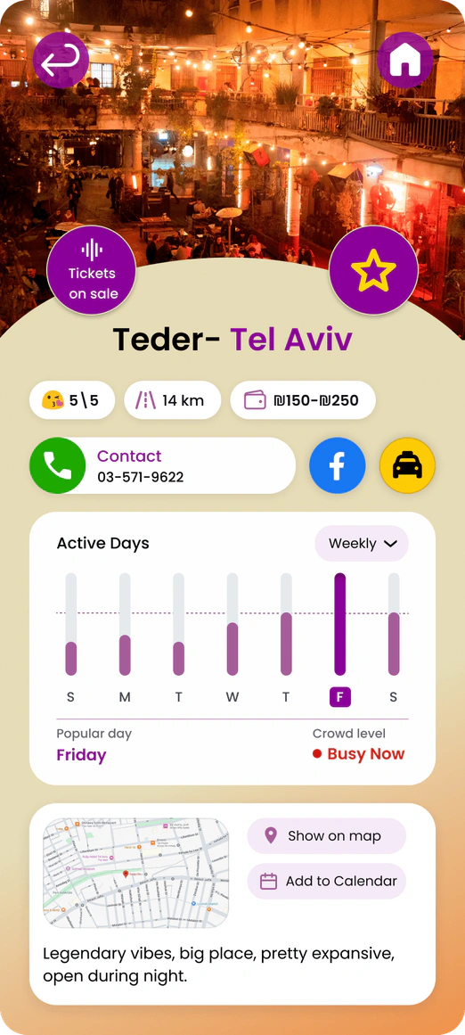
The app earns a small commission whenever users book tickets, order rides or make a purchase through integrated links like taxis or event platforms directly from the recommendation screen.
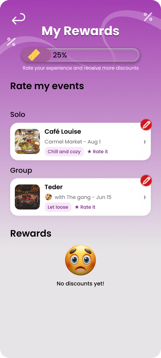
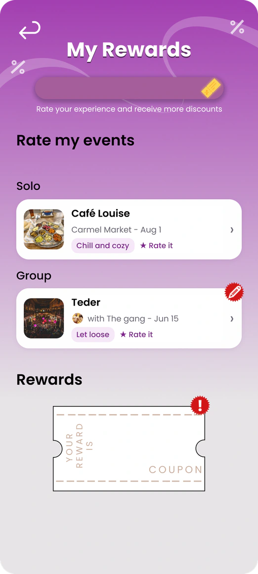
Entertainment venues pay for promotion inside the app through personalized coupons offered in the rewards system. Users receive these rewards after leaving a review, which helps improve the suggestions.
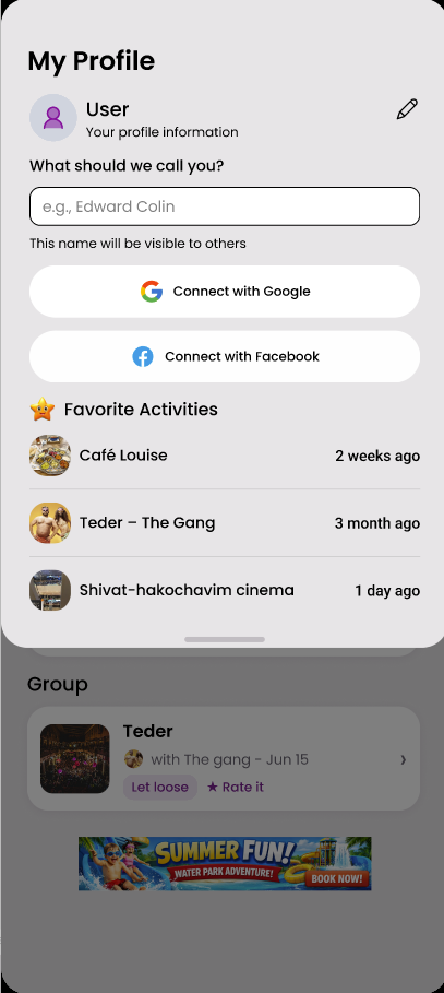
Non-intrusive ads appear only on the home screen, never during active user flows. This provides steady income without harming the user experience or cluttering the interface
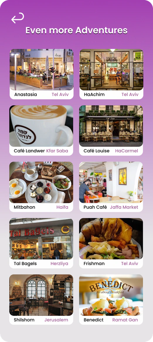
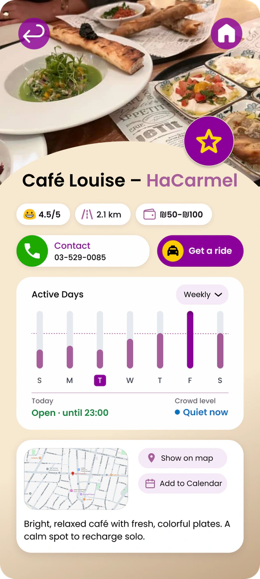
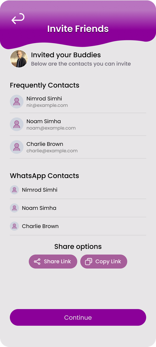
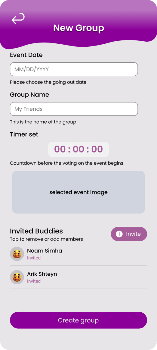
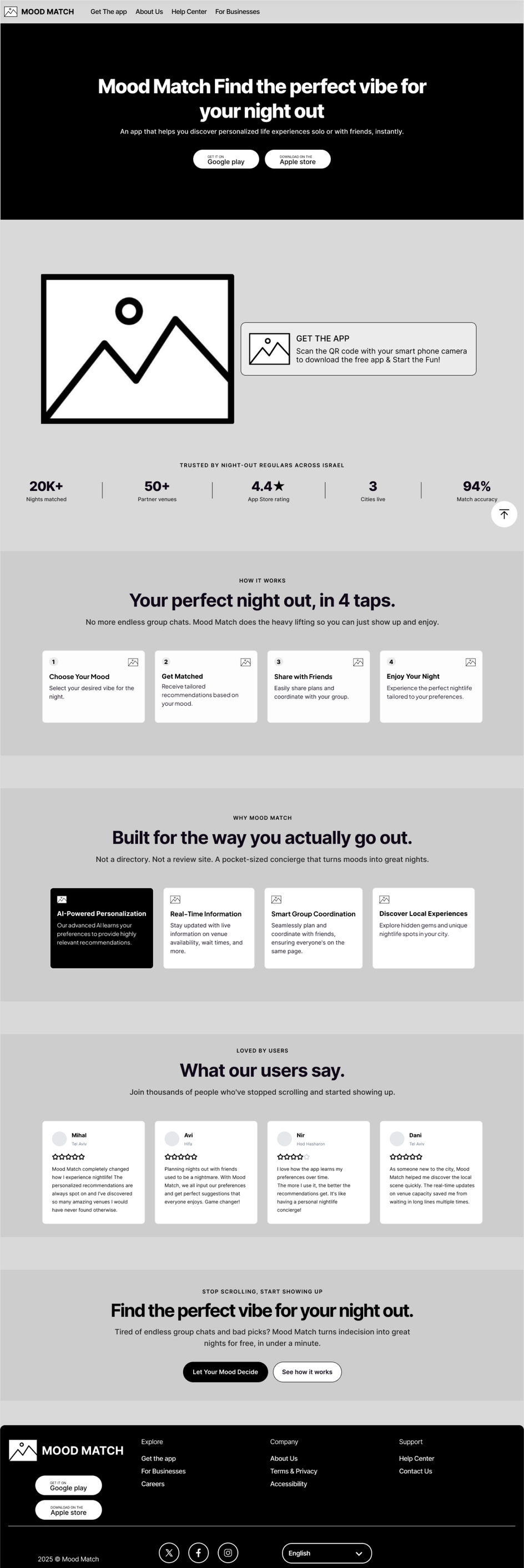
From the first wireframes through the design system to the finished screens, this chapter follows how the interface took shape, and closes with the landing page that presents it.